It turns out yesterday’s JetBlue Experience isn’t the only Experience out there. There’s also The Flagship Experience from American Airlines, created by TM Advertising. Snappy animation—but it lacks JetBlue’s authenticity.
Archive for May, 2010
URL
Monday, May 31st, 2010URL
Sunday, May 30th, 2010The JetBlue Experience, created by Firstborn, captures just what it is that makes travelling on JetBlue different. It’s a very nice, simple design.
URL
Sunday, May 30th, 2010A vision of what air travel could have been: “The Brabazon Report assumed that the wealthy flying the plane would consider a long trip by air to be uncomfortable, and they designed the Type I for luxury, demanding 200 ft³ (6 m³) of room for every passenger, and 270 ft³ (8 m³) for luxury. This is similar to the interior room of a small car.”
Continited
Sunday, May 30th, 2010 “Airlines are an ego-driven business,” according to airline analyst Robert Mann. “I joke, but only partly, that the three biggest issues in airline consolidation are: What are we going to call it? Where is it going to be based? And who is going to run it?”
It makes sense. If not for ego, why would anyone go into the airline business? To make money? You’d be better off stuffing your money under a mattress. And then setting the mattress on fire.
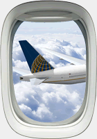
In any event, the parties to the merger of United and Continental have been careful to treat egos on both sides of the deal equitably. The combined company will be based in Chicago, United’s hometown, but will be led by Continental’s CEO. And it will pair the United name with Continental’s logo, livery, and colours.
You have to wonder how close we were to an airline with Continental’s name and United’s logo. Did they flip a coin? Surely there were no high-priced brand consultants involved. The decision was made in a board room. Then they sent one of the lawyers out to mock up a picture of the new plane in Photoshop.
It remains to be seen how long this arrangement will last. The Continental identity is already nearly twenty years old and looking a bit dated—there may be a redesign in the combined airline’s future.
URL
Saturday, May 15th, 2010Come to think of it, there are an awful lot of airlines whose logos feature a bird in a circle… (via Quipsologies)
URL
Monday, May 3rd, 2010One of the most interesting features of the United-Continental merger Web site, launched today, is the community map. It’s surprising how little overlap there is on routes—it makes you think the merger might be a good idea after all. Well done, public relations professionals!