
A war of words between Scoot and Spirit Airlines escalated today, according to AdAge: the Singaporean LCC flew a big yellow blimp outside Spirit’s headquarters, defiantly painted with the words, “Hey Spirit, You Can’t Have Our Scootitude!” ((I cringe at having just typed the word “scootitude” and I hope you can forgive me for forcing you to read it.))
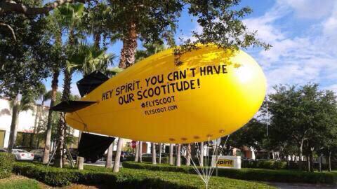 Scoot’s blimp. (Source: Scoot)
That the blimp was yellow is significant. Scoot alleges that Spirit has been “inspired” a little too much by Scoot’s brand look and feel. Same color. Same icons. Sometimes even the same typography. Scoot fired its first volley last week, with a video from its CEO:
So a little yellow birdie told us that a certain American airline looks familiar. It looks like #ScootInspires their current campaign…well, we’re really flattered! Watch this video and tell us what you think!
Posted by FlyScoot on Thursday, April 9, 2015
Following the video, Scoot sent Spirit Airlines a brand manual to help them get their supposedly derivative Pantone colours right. They also declared they would rename one of their airplanes after Spirit in appreciation of their fans. The campaign is being orchestrated by Saatchi, Singapore.
The irony, of course, is that in accusing Spirit of ripping off Scoot, Scoot is in a way ripping off Spirit. Because this is exactly the sort of stunt Spirit is known for. If not for the fact that the American carrier has been pretty quiet about the whole thing, one might almost think they were in cahoots.
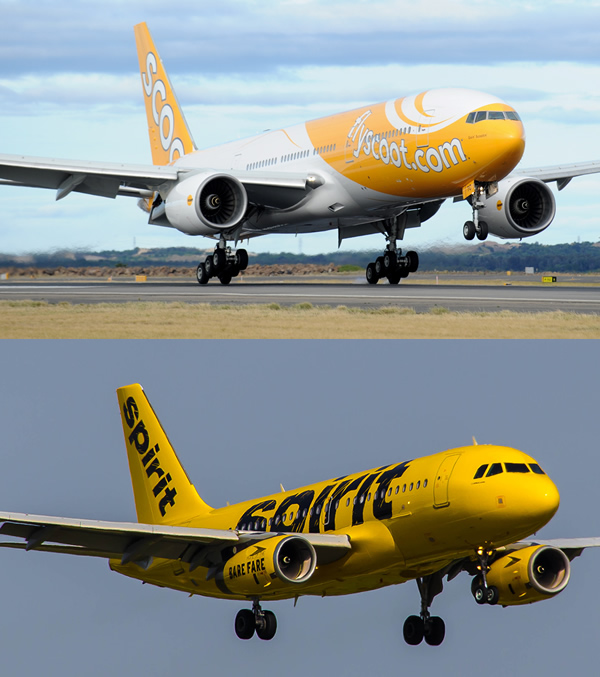
How similar are they? Certainly the logos bear little resemblance, and the liveries of the two carriers are connected only by their use of very different shades of yellow. Their Web sites are about as similar as any two airline Web sites would be.
At the level of advertising, collateral, and social posts, on the other hand, the similarities are striking.
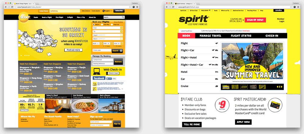 The two Web sites, side by side.
I’m a creative, so I don’t like to throw around accusations of plagiarism lightly. Coincidences do happen. But between the ubiquitous yellow background, the handmade typography, and the cartoonish illustrations, it’s quite a coincidence. Enough to make you wonder if Barkley, Spirit’s agency, was indeed a little too “inspired” when it launched Spirit’s new look last year. ((Barkley’s other work for the brand has been quite good. Since the agency took over the account a little over 18 months ago, Spirit’s counterintuitive “hug the haters” strategy has turned some of its weaknesses as a brand into strengths.))
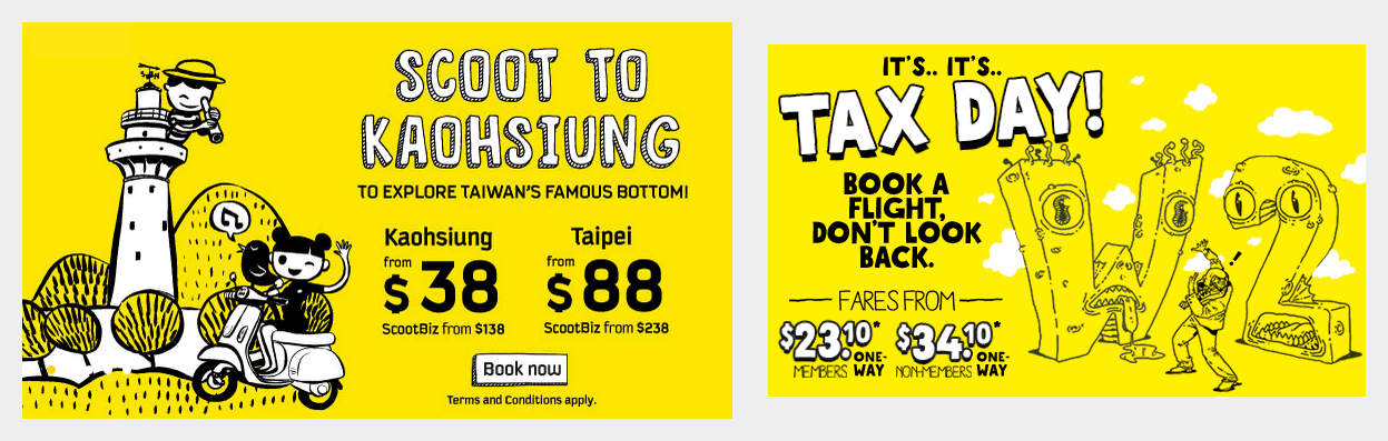 A comparison of banners from the Scoot and Spirit homepages, taken today. If not for the reference to W2 forms, it would be very difficult indeed to tell the difference.
If Scoot were really taking this seriously, of course, they would send cease-and-desists, not blimps. But Spirit and Scoot are separated by a very big ocean. Unless and until Scoot expands its routes to the United States (there seems zero chance Spirit would ever fly to Singapore) the chance of any consumer confusing the two airlines is slim.
So for now, it’s merely a fun opportunity for Scoot to gain some attention. And if there’s anything Scoot might have learned from Spirit, it’s the value of attention.
(Image credits: Photo illustration with images from Scoot and Spirit Airlines.)
bRONtQ5lFHB
Posted by unroped on 20 February 2025 at 9:54 am
ZdNWPz4CHri
Posted by 混合ポルノ on 21 February 2025 at 2:11 am