By a remarkable coincidence, two U.S. airlines launched new brand identities this week. Southwest revealed its new look at a lavish ceremony on Monday. Frontier unveiled its new look at a somewhat less fancy event earlier today. And the week is young — who knows what excitement is yet to come!
In their own ways, both Southwest and Frontier are returning to their roots. That makes sense for one airline; it’s a perplexing choice for the other. The difference says a lot about what it means to be a “low-cost carrier” today.
Southwest Airlines invented low fares. At least, that’s what its new commercial says. But if you’ll forgive the pun, the heart of its brand has always been about more than cheap flights. Southwest’s brand lives in its ticker symbol and in the code for its home airport: LUV.
Over the past three decades, Southwest has built a brand that must be the envy of the airline industry. It has done this, in no small part, by spending far more on advertising than its peers. But more importantly, it has nurtured a strong company culture.
People like Southwest. In the Bureau of Transportation’s most recent Air Travel Consumer Report, Southwest had the third most delayed flights, the most flights arriving late 70% of the time or more, the fourth most mishandled bags, the fourth most denied boardings… and the second fewest customer complaints. Luv, indeed.
Most airlines would kill to have a brand as strong as Southwest’s. But last year, the airline nearly threw it all away. A campaign by Southwest’s new agency, TBWA\Chiat\Day, seemed corporate and generic. In a transparent attempt to appeal to business travelers, Southwest appeared to have turned its back on its spirit.
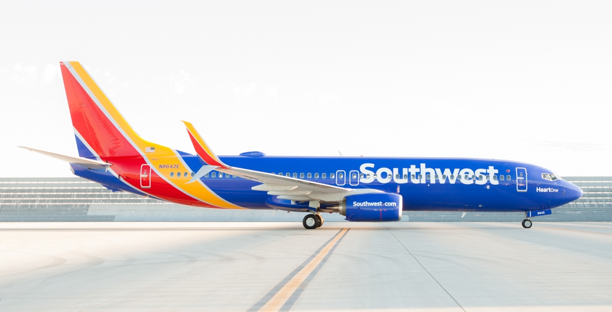
Yesterday’s rebrand — sorry, “bold new look” — proves that the spirit is alive and well. It comes in the midst of a renaissance for Southwest. Earlier this year, the airline began its first international flights. Soon, the company will finally finish absorbing AirTran after its 2011 merger. And on Oct. 13, the end of the Wright Amendment will finally allow Southwest to fly beyond Texas’ immediate neighbors from its home base at Dallas Love Field. That last change gets to the very soul of the airline.
The new look, designed by Lippincott, is bold and fun. It brings new prominence to the heart, which has always been a part of Southwest’s identity but had rarely been used particularly consistently. The livery shows a clear connection to what has come before while being more modern and lively. If anything, the new look feels even more Southwest than the old one.
This time, the launch commercial is by GSD&M, which ought to understand the brand as well as anyone after more than 30 years of working on it.
By focusing on the airplane, the spot loses something of the human touch. But the sentiment behind it is beautifully expressed: “Without a heart, it’s just a machine.” Rashida Jones is perfectly cast as the voiceover.
Southwest’s brand is important because the airline is no longer the low-fare leader. A study in 2013 found that Southwest’s prices were higher than the competition 60% of the time. It may well have pioneered the low-cost carrier, but that’s no longer enough. For we now live in the era of the ultra low-cost carrier.
One of those ultra low-cost carriers launched a new look this morning. The last several years have seen Frontier Airlines’ transformation from a low-cost carrier in the style of jetBlue or Southwest to an ultra-low-cost carrier in the style of Spirit Airlines or Allegiant. The airline has added fees for checked and carry-on bags and taken away free sodas.
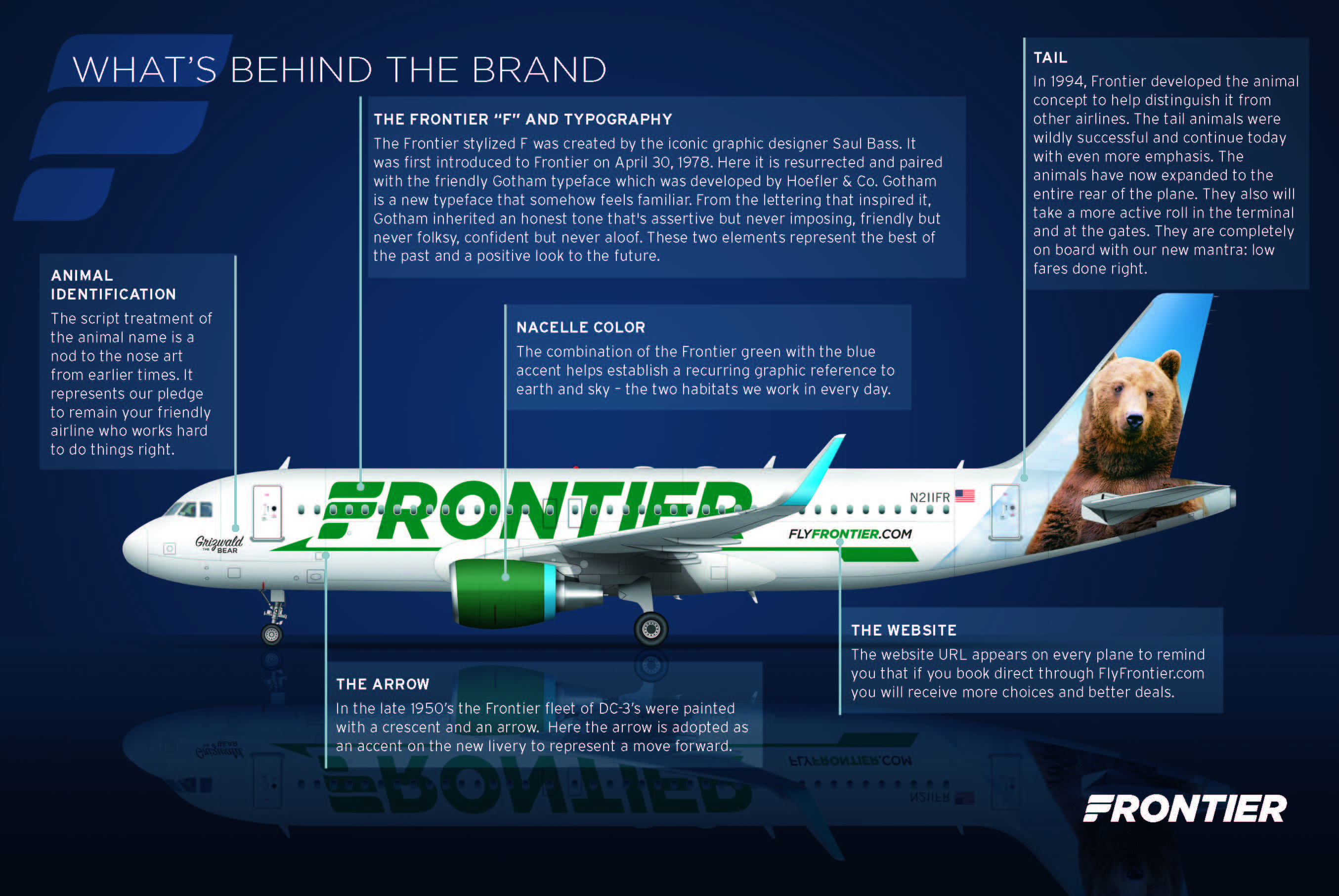
This is the kind of strategy that has made Spirit a Wall Street darling. Which is what makes the new identity’s appeal to the past so strange. After all, few of those passengers enjoying Frontier’s cut-rate fares even remember the original Frontier Airlines, defunct since 1986. Yet the new look is replete with references to that defunct company, as this infographic makes clear:
The flying F in the new Frontier wordmark comes from Saul Bass’ 1978 design for the original Frontier. The arrow painted along the fuselage goes back even further, to the 1950s. The animals on the tail have been there since the mid-1990s. That means the new livery incorporates brand elements from three different decades, and none of them is relevant to the airline as it now exists.
The first “Frontier Airlines” could only exist in the regulated era; it faltered and eventually failed shortly after deregulation. By contrast, today’s Frontier Airlines could only exist under deregulation. The callback to an earlier time seems out of place, especially at a time when Frontier is trying to get customers used to its new ultra-low-cost offering. The historical allusions of this rebrand do little to help.
What does help — and this will be a bit of a back-handed compliment, but it’s entirely true — is that the new livery looks cheap. The mishmash of different elements may be inelegant and unrefined, but it also signals a brand that is seriously dedicated to low fares. Frontier isn’t a fancy airline. Its decidedly less-than-fancy new look suits it.
The proximity of thee two rebrands offers a convenient comparison between two airlines headed in different directions. Southwest takes advantage of a strong brand to sell tickets even at higher prices than its ULCC competitors. Frontier seeks to signal its commitment to low fares and an unbundled product.
There’s room in the market for both approaches. But their existence raises the question of whether there’s even a point any longer to calling an airline a “low-cost carrier.” The category is nowhere near as monolithic as the label suggests.
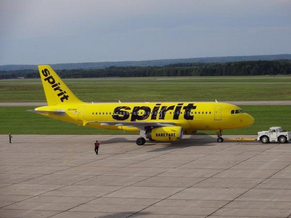
Update, Sept. 16, 2014: Today, a week after Frontier, Spirit Airlines hopped on the new livery bandwagon. Spirit’s new look, unlike Frontier’s, seems perfectly aligned with its ultra-low-cost business strategy. As a Canadian, I can’t help but be reminded of the plain yellow packages of the No Name generic brand found in Loblaws grocery stores. Much of Spirit’s recent advertising has been aimed at setting consumer expectations: you won’t get much on Spirit, but you won’t pay much, either. The yellow planes aren’t elegant, and they aren’t beautiful, but they are very well-suited to communicating the kind of airline Spirit wants to be.


