Introduction
On the first Monday in March, 1961, the unthinkable struck Eastern Air Lines: a deficit. After 26 years of profits, Eastern declared a loss of $3.6 million.
The loss in 1960 marked the beginning of a decade of change at Eastern. It revealed fundamental problems from which the airline would never really recover. But it also spurred one of the most remarkable reinventions of any airline brand, ever. The changes at Eastern went far beyond a new coat of paint on its airplanes. They reflected an airline that not only portrayed itself differently, but saw itself differently.
For in just ten years, Eastern went from “bums on seats” to “the Wings of Man.”
Fly with confidence
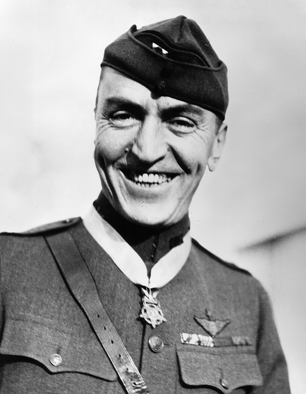 Capt. Eddie Rickenbacker wearing the Medal of Honor in 1930. (Source: U.S. Air Force)
“Putting bums on seats” is a colourful description of the airline business that came from an equally colourful character.1 A fighter ace from World War I, Eddie Rickenbacker was one of America’s most famous war heroes. After the war, he’d driven race cars and started a car company before becoming the general manager of Eastern Air Lines in 1935. He became president in 1938.
Though his employees called Rickenbacker “the Captain,” he ran Eastern like a general. His autocratic style earned him both the respect and the fear of the airline’s employees. Rickenbacker was a demanding boss who expected his executives to be at the office with him every Saturday and did not easily forgive incompetence. He didn’t believe in coddling employees. Or, for that matter, customers.
Rickenbacker understood better than many airline executives of his day that the secret to a successful airline is to have airplanes in the air for as long as possible with as many seats filled as possible. He ran his airline in accordance with two of the bedrock laws of the industry: First, planes lose money every second they’re on the ground. Second, a seat left unsold can never be sold again.
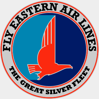 The logo Eastern Air Lines used, with few variations, from 1936 until 1960. The logo was designed by Cardwell Higgins, a pin-up artist.
Under Rickenbacker, Eastern pursued operational and technical excellence, often at the expense of customer service. The Captain didn’t see why the airline should spend more than $1.25 on an inflight meal2 or invest in jetways to protect passengers from the elements.3 Surely what passengers really wanted was safe, reliable transportation to their destination?
The spirit of Eastern was embodied in the title of its company song: “Keep ‘Em Flying.” The song was written by Wayne Bevis and Frank Feltrup, two Florida employees in Eastern’s sales department, and it was distributed to the airline’s workforce in sheet-music form in 1952. To a tune very much resembling a college fight song, “Keep ‘Em Flying” praises the virtues of hard work but makes no mention of customers:
For Eastern Air Lines, we pull together
and soon the hardest task is done.
In foul or fair times, we laugh together
when we can take a break for fun.To keep ’em flying, there’s no denying
we’ll try some bigger, bolder scheme.
When you compare lines, choose Eastern Air Lines.
We’ve always got the winning team.
Despite his antipathy to the softer, mushier sides of customer service, Rickenbacker believed in advertising. Indeed one of his closest advisors, Brad Walker, was an account executive from Eastern’s advertising agency, Campbell-Ewald.4 But while Eastern advertised, the content of that advertising was shaped by Rickenbacker’s conception of an airline’s purpose: reliable transportation.
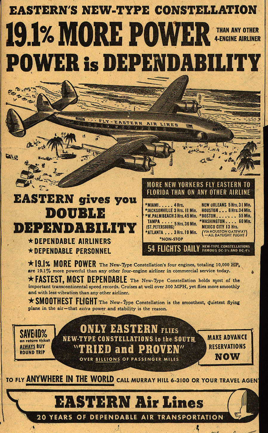 A typical Eastern advertisement from 1949. “The Captain abhors white space in an ad like nature abhors a vacuum,” said Brad Walker.5 (Source: Ad*Access Project)
Although a deadly crash in 1938 had convinced Rickenbacker never to use the word “safe” in any ad,6 safety was strongly implied in almost every ad Eastern produced in the 1940s and 50s. Eastern, the ads declared, was “tried and proven over billions of passenger miles.” The advertising placed a heavy emphasis on the experience of Eastern’s pilots and the reliability of its airplanes — to the point that ads often specifically listed the horsepower of the plane’s engines. In the 1950s, Eastern’s tagline became “Fly with Confidence.”
This had been Eastern’s winning formula for decades, and up until the late 1950s it would’ve been hard to argue against it. Eastern turned a profit year after year. It carried more and more passengers, if not in comfort, then at least in relative safety. It flew the most advanced planes in the sky, including the DC-7 and the Lockheed Constellation. Yet this success disguised serious problems in the offing.
Rickenbacker was famously slow to embrace jets. With the Jet Age just about to dawn, he spent twice as much ordering propeller-driven planes such as DC-7s, Constellations, and Lockheed Electras as he budgeted for jets in 1955.7 Worse, worried about overcapacity and underpowered engines, Eastern cancelled many of its early jet orders, only to have those orders snapped up by competitors, particularly Delta. With Eastern’s first jets still a year away, Delta started flying those DC-8s against Eastern’s Electras on the lucrative New York–Houston route. Eastern’s load factor had been an astronomical 90%. Within two months of jet competition, Eastern abandoned the New York–Houston nonstop route entirely for a time.8
Rickenbacker’s reluctance to order jets made perfect economic sense for Eastern. The airline had only a couple of medium-haul routes; the vast majority of its network was made up of short hops where jets would offer no time savings over turboprops. But Rickenbacker underestimated how much damage the lack of jets would do to Eastern’s brand. He had anticipated a slow transition to jets. Instead, the public started to demand jet travel almost immediately. Even Eastern’s brand-new Electras seemed “old” when compared to the DC-8s and 707s competitors were flying.9 It would take more than a decade for Eastern to catch up to the other trunk carriers, and the cost of doing so would go a long way toward dooming the airline.
Rickenbacker’s hostile relationship with Washington hurt too. At a time when airlines lived and died by the diktats of the Civil Aeronautics Board, Eastern did a lot of dying. In the CAB’s hearings, Eastern consistently failed to expand its network beyond the East Coast and was the only carrier among the “Big Four”10 without a transcontinental route system. As a result of this north-south orientation, Eastern depended much more heavily than other airlines on leisure travelers over business travelers, who are considerably more lucrative. Sixty percent of its traffic was generated from December to February when northerners flew south on vacation.11 Moreover, the effect of the company’s short routes was reflected in the company’s yields: even in 1965, after shedding some of the shortest routes, Eastern carried one sixth of the total trunkline passenger traffic but earned less than one tenth of the total revenues.12
Worst of all, Eastern’s passengers had grown fed up with the airline’s indifferent service. A pair of businessmen from Philadelphia formed an organization called the WHEAL Club — for “We Hate Eastern Air Lines” — that soon counted thousands of members. To save time, WHEAL issued cards for its members to give to the agents at Eastern ticket counters. They read, “What is it this time?”
Some of these problems were operational, but they were branding problems as well. Eastern’s brand was hurt by its poor service and delayed entry into the Jet Age; in turn that poor image killed its chances of more favourable decisions from the CAB. As more carriers gained the authority to operate on Eastern’s routes, Eastern faced greater competition from airlines that consumers just plain liked better, such as Delta and National.
Dependability… from the ground up
By 1959, Eastern’s largest shareholder, Laurance Rockefeller, worried about Eastern’s future and Rickenbacker’s advancing age — the Captain was nearing 70. At the urging of Eastern’s board, Rickenbacker stepped down from day-to-day operation of the airline, at least in theory, becoming Eastern’s chairman. Malcolm MacIntyre, a lawyer and former Under Secretary of the Air Force who had worked at American, became the new president and CEO. The arrangement didn’t really work; Rickenbacker continued to hold major influence over the airline, and the two men clashed frequently. These clashes made change difficult, even though Eastern needed it desperately.
 The streamlined falcon that served as Eastern’s logo in the early 1960s. Except when it didn’t.
Under MacIntyre, the airline did make some progress to improve its service and image. When the jets finally arrived, they were painted in a shiny new livery with a golden falcon on the tail. The livery was most likely designed by the office of Harley Earl, a famous automotive designer associated with the streamlined look of the 1950s.13 As such, the new look was a step in the right direction for Eastern, an improvement over its 1940s livery and an interim, circus-like paint job Rickenbacker had ordered for the Electras. But it was a product of the present, not the future.
The streamlined falcon became a logo of sorts for Eastern, except when it wasn’t — sometimes the airline used a compass E mark instead,14 and the falcon was drawn differently in different contexts. The airline’s name was rendered in different typefaces from a slab serif to a delicate Didot-like face to an oblique sans to an extended grotesque. The new look was progress. It was not, however, consistent.
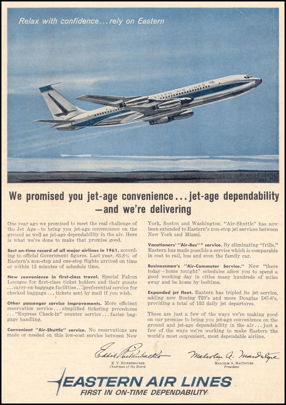 Eastern’s advertising in the early 1960s was cleaner than under Rickenbacker, but it focused on the same themes and still had not caught up to the revolutionary changes happening in advertising at the time. (Source: The Gallery of Graphic Design)
The advertising improved as well. MacIntyre and Walker devised a new campaign under the tagline “New Things are Happening at Eastern Air Lines.” The new campaign, proudly featured in Eastern’s 1961 annual report, still focused primarily on the traditional theme of Eastern’s advertising: dependability. But the layouts were streamlined and the copy showed a wit that had been lacking under Rickenbacker.
The airline continued to advertise on the radio and, increasingly, on television.15 One jingle, written by Jerry Jerome, was typical for its time. It’s jazzy and upbeat; it comes from an era when jingles were used to drill a message into your brain more than to set a mood, an era when advertisers still didn’t really trust the use of emotion in advertising.
Fly Eastern Airlines.
Eastern Air Lines.
Fly Eastern. You’ll love to travel by
Eastern. Where new things are happening.
Eastern.
Fly Eastern Air Lines.From the ground up,
travel on Eastern’s easier.
From the ground up,
Eastern’s service is speedier.Fly Eastern Air Lines.
Eastern Air Lines!
Though Eastern’s advertising had been modernized, it was still far from the front lines of the Creative Revolution then raging on Madison Avenue. And that wasn’t the only way the airline fell short. Despite innovations including the Eastern Shuttle between New York, Boston, and Washington, the first half of the 1960s was nearly disastrous.
The loss in 1961 was nearly triple the loss in 1960, and in 1963 Eastern lost a spectacular $38 million as the rest of the airline industry recorded its highest profits ever. The carrier’s load factor plummeted, sinking below 50% in 1962.16 These losses were clearly unsustainable. MacIntyre had to go — and this time, so did Rickenbacker. In early 1963, the board of Eastern Air Lines went looking once again for a new man to lead the company. They found Floyd Hall.
Operation Bootstrap
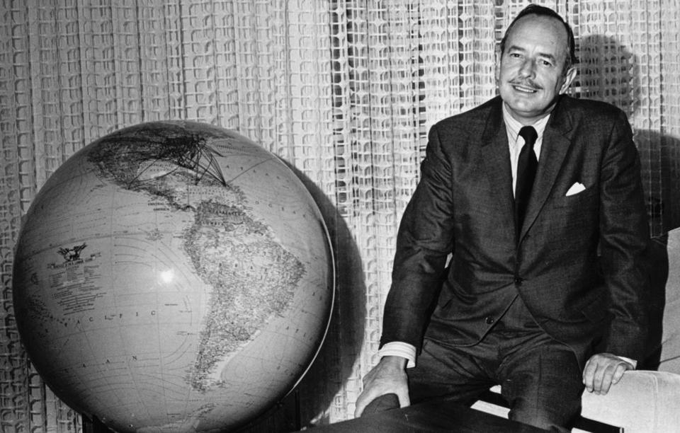 Floyd Hall, who led Eastern from 1963 until 1976. (Source: Boston Globe)
Rickenbacker’s retirement was part of a wave of successions at the airlines of the 1950s and 1960s. The first generation of larger-than-life airline entrepreneurs — people like Rickenbacker, C.R. Smith, Howard Hughes, and Juan Trippe — gave way to a new generation of technocratic organization men. The shift was inevitable. Airlines had become major enterprises. Their new status as symbols of the modern corporation demanded modern management.
Hall at least had the virtue of having once been a pilot at TWA. There he rose through the ranks to become the airline’s general manager and very well respected across the industry. But TWA had few problems for him to tackle. Floyd Hall wanted a challenge, and Eastern was a veritable basket case. In December of 1963, he took over as Eastern’s president and chief executive officer.
Hall soon found that Eastern was in even worse shape than he anticipated. By this point, service wasn’t Eastern’s only problem. Operations had slipped badly too. A third of its flights arrived late. Among the 11 trunk carriers, Eastern had sunk to 10th in on-time performance. Up to 3% of its flights every day were being cancelled by maintenance problems. Eastern lost four bags for every 1,000 passengers — the worst record in the industry.17 The airline was a mess in every way.
Hall acted fast. He immediately brought in a new slate of executives, most of them recruited from other airlines. He implemented an ambitious new program, Operation Bootstrap, to bring Eastern back to profitability and to address complaints about its service. But Hall knew that wouldn’t be enough.
The hardest part of a turnaround is convincing the great flying public that things have really changed. It’s not as easy as hanging an “Under New Management” sign outside the terminal. When times are tough, airlines often need to overcome years of bad perceptions, experiences, and memories — fast. Those are the times for for bold strokes. The changes in the company must be made visible, or they are all for naught.
The reinvention of Eastern’s brand lay at the heart of Operation Bootstrap. It was an effort Hall lead personally, knowing it would be critical to success but also that a new corporate identity was the surest way he could leave his mark on the company. “Today, business has come to realize that identity itself is an important management element, an element that can be structured to specific goals,” Hall wrote. “A positive corporate identity system and program is as necessary today to a successful company as a production line and a marketing operation.”18
A new corporate identity would make it easier for Eastern’s management to impose its vision on the company, but the identity had to be pervasive and it had to be consistent. This was becoming something of an article of faith in corporate America. Eliot Noyes, then IBM’s design consultant, said,
In a sense, a corporation should be like a good painting; everything visible should contribute to the correct total statement; nothing visible should detract. Thus, a company’s buildings, offices, graphic design and so forth should all contribute to a total statement about the significance and direction of the company.
In the next decade, every one of the major airlines in North America would embrace this attitude to corporate identity, but at the time Eastern was still a trailblazer. Pan Am had launched a graphic program overseen by the architect Edward Larrabee Barnes in 1957, but that program had proceeded haphazardly with uneven support from management.19 Lufthansa was in the midst of an identity redesign led by Otl Aicher,20 but that process was slow and on a somewhat smaller scale. Hall needed instant results.
In Hall’s first letter to stockholders in early 1964, the new chief executive promised that “a plan for improving the Company’s public appearance is being implemented to express the ‘new Eastern’ and to provide a single, distinguished corporate identification.”21 Hall had already begun to assemble the team that would deliver it.
Come fly with Eastern
When Hall was named as MacIntyre’s successor, Eastern’s advertising account was already in review and close to a decision. The contestants were invited back to present to the new management team, but ultimately it was outgoing executives who made the call. On Dec. 3, Eastern awarded its account to Benton & Bowles.
But if Hall was looking for radical changes to Eastern’s image, B&B was not the agency to deliver them. It was a conservative shop with a roster mostly composed of packaged goods clients. It had no airline experience. Perhaps worst of all, B&B was tainted by association with the previous regime.
B&B kicked off Eastern’s print campaign on Feb. 3, 1964, with television following a month later. The work was uninspired and sometimes downright tedious.22 Under MacIntyre, Eastern had taken to calling itself “the nation’s most progressive airline.” But the 1964 campaign was not particularly progressive. Certainly it would never be able to give Eastern the corporate image shot in the arm Hall believed was necessary.
Just 23 weeks after selecting B&B, Eastern fired them. Without a review, the airline moved its account to Young & Rubicam, effective immediately.23
In February, Hall had engaged Lippincott & Margulies to consider Eastern’s brand. Lippincott was an established if somewhat conservative brand consultancy, well-known for the identities it had designed for Chrysler, U.S. Steel, Citgo, and other blue-chip clients.
Its approach to rebranding Eastern had at least the whiff of science about it. It began with intensive market research. Lippincott compared Eastern with eight other airlines and found that Eastern was the best-known. Unfortunately, what Eastern was known for wasn’t always good: lost baggage, poor service, and unfriendly staff. There were, however, three hopeful signs:
- Eastern was considered a major airline on par with United, American, and TWA.
- Eastern was seen as innovative, mostly because of the Eastern Shuttle.
- Consumers recognized the falcon symbol and associated it with Eastern.24
Lippincott presented its findings to Eastern along with its recommendations: a new corporate symbol, a new color scheme, and a design program that touched everything from aircraft to ground support equipment to signage to ticket offices to stock certificates. The name “Eastern” was retained but only after some debate.25 The airline’s management approved the work, and a design team under Lippincott vice president Arthur King got started designing the new Eastern.
See how much better an airline can be
 Eastern’s new mark, unofficially known as the “hockey stick,” was introduced in late 1964 and served until the company’s demise in 1991.
The mark that appeared on the cover of the Oct. 25, 1964 edition of Eastern’s timetable was sleek, bold, and modern. It represented a radical departure from the marks of the past, with only the barest reference to the Eastern falcon. The falcon was so abstract that the logo quickly picked up a nickname that would stick until 1991: the “hockey stick.”
The name, “Eastern,” was rendered in a futuristic extended typeface. “Air Lines” was dropped except in the most formal circumstances; “Eastern” was thought to be sufficient. The new livery was simple but elegant. The airplanes were painted in white, with a stripe in two colours — Ionosphere Blue and Caribbean Blue — that ran from the nose down the length of the fuselage and up the tail. The new corporate signature was painted just behind the main door. Remarkably, all of these elements — the mark, the logotype, and the livery — were retained with very few changes all the way until Eastern shut down 26 years later.
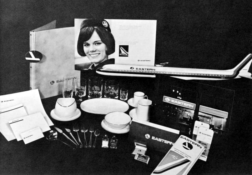 Eastern’s comprehensive new look appeared on every touchpoint: letterhead, glassware, ticket jackets, baggage tags, uniforms, and more. (Source: Lippincott)
The new look spread throughout Eastern with remarkable speed. It appeared on timetable covers, ticket jackets, baggage tags, letterhead, and menus. It appeared on flight attendants’ wings and on pilot’s caps. It influenced major renovations of Eastern’s ticket offices, check-in counters, and first class lounges. The airline expected to finish repainting its entire fleet by mid-1965 — barely half a year after the identity was first revealed, an extraordinary feat considering both the cost of painting an airplane and the cost of taking it out of service while it’s being painted.
 The modernist trend in North American airline marks, from the 1950s to the 1970s. Click on the image to enlarge.
The modernist architect Ludwig Mies van der Rohe declared that “less is more.” It’s hard to imagine an identity that demonstrates that philosophy more convincingly than Eastern’s. After sniffing that Lippincott was “known more for the quantity rather than the quality of its designs,” one design critic grudgingly admitted that the Eastern mark was “really first-rate.”26
Within a few years, the modernism of Eastern’s new look became the norm throughout the industry. The stylized birds and Indian heads of early airline marks gave way to new, minimalist symbols. The new symbols tended to be more abstract and geometric than their predecessors. Literal representations of flight or geography were replaced with more conceptual images: lines to suggest movement, a circle to suggest the globe.
The trend in airline marks reflected a larger trend in corporate identity design generally. The same influences (and in many cases the same designers) shaped identities for Westinghouse, IBM, CBS, Canadian National, and the Bell System. By participating in this transition, the airlines demonstrated to the world their graduation from aviation pioneers (in the mould of Eddie Rickenbacker) to modern corporations (as embodied by Floyd Hall.)
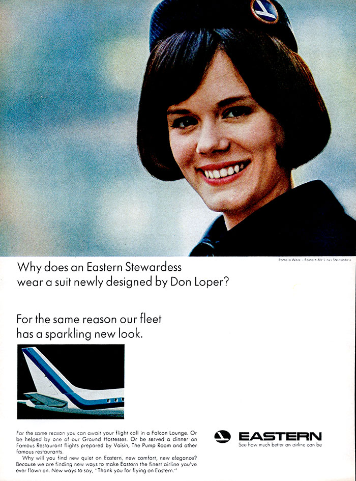 Over the tagline “See how much better an airline can be,” Eastern’s 1965 print campaign put great emphasis on the airline’s visual transformation.
Young & Rubicam’s advertising campaign was equally progressive. The campaign, launched in January of 1965, touted many of the service improvements Eastern had made, including flights catered by famous restaurants, “ground hostesses” at Eastern terminals, Rosenthal china in first class, and a fleet that was finally catching up to the Jet Age. But it placed a particular emphasis on changes to Eastern’s visual environment, including the airline’s new colours and updated uniforms. The campaign’s tagline, “See how much better an airline can be,” was no accident. The new look was front and center. The new Eastern, the campaign suggested, could best be experienced with your eyes.
The print campaign was lavish. Eastern had previously avoided magazine advertising, spending the bulk of its budget — up to 90% of it — on newspapers.27 That changed with this campaign. Eastern ran ads in prestigious national publications including Atlantic Monthly, The New Yorker, Fortune, and Vogue. These were often expensive four-colour spreads.28
The most significant part of the launch was Eastern’s sponsorship of NBC’s coverage of the inauguration of Lyndon Johnson on Jan. 20, 1965. Eastern paid $600,000 for the sponsorship, which included six brand-new television spots, all of which were screened in advance by the presidential inauguration committee.29 One spot seemed particularly appropriate to the Great Society themes of the inauguration:
Another spot showed one of Eastern’s new 727 “Whisperjets” scaring the living daylights out of some birds. This spot won a Clio for Y&R in 1966 and was named to the Clios hall of fame six years later. It was also a career-maker for Stephen Frankfurt, a Y&R art director who not only led creative on the Eastern account for many years but who also became the president of the agency a few years later at the age of 36.30
Nothing like these spots had ever been seen before in airline advertising — maybe in advertising, period. The spots were dramatic, artful, intelligently written, and beautifully shot. The narrator — Alexander Scourby — was perhaps best known for recording the King James Bible, and his voice lent the spots an undeniable gravitas. But the element Eastern was perhaps most proud of was the airline’s new theme music:
Eastern sent the music from the commercials out to its employees on a 7″ record, suggesting that the new theme was an element of the new Eastern’s brand every bit as important as the new logo and the new corporate colours. The theme was composed by Clay “Buck” Warnick,31 a composer and arranger who worked for Y&R and would shortly become its music director.32 In contrast to the peppy but rather empty jingles Eastern had commissioned in the past, the new “Fly Eastern” theme was soaring and powerfully emotional. In fact, it was perhaps even a little overwrought, although some variations were more restrained.
For commercials promoting Eastern’s vacation destinations in Mexico, Puerto Rico, and Miami, Y&R hired the bossa nova singer Astrud Gilberto. Just the previous year, Gilberto had gained international fame and a Grammy for her recording of “The Girl from Ipanema.” True, Gilberto was from Brazil — a country to which Eastern would not fly until the 1980s — but never mind. Her singing added a modern Latin flavour.
But Eastern had still grander musical plans. Even before the campaign launched, the airline had commissioned the conductor Andre Kostelanetz to create a symphonic suite, Images in Flight,33 based on the new Eastern Air Lines theme. The suite would be recorded by the New York Philharmonic and released to Eastern employees on an album produced by the legendary Teo Macero at Columbia Records.
It was decided early on that each of the four (originally five) movements would be inspired by the folk music of a different Eastern destination.34 Kostelanetz suggested that each movement should also suggest a different time of day.35 Images in Flight would start at sunrise in Puerto Rico; fly north to Montreal by noon; return to twilight in Texas; and finally land in Mexico at midnight.
Paul Creston, a prominent American composer, was at first engaged to compose all four movements, but for some reason, only two of his compositions (“High Noon–Montreal” and “Twilight–Mexico”) were eventually used; the others were written by Alan Hovhaness (“Sunrise—Puerto Rico”) and Henry Cowell (“Twilight—Texas”).36 It would be Cowell’s final work.37
At first, “the composers felt a little bit constricted that they had to use a certain theme” — the Eastern theme — but Kostelanetz “told the composers, well don’t worry too much about this because I know by the time no one will be able to tell whether you have used it or didn’t use it. Just write beautiful music.”38 The Eastern theme is woven through the piece, but it is indeed very subtle.
The suite was recorded by the New York Philharmonic under the baton of Andre Kostelanetz at Lincoln Center on March 20, 1965.39 An introductory script written by Y&R for Kostelanetz, but never actually used, declares the music
the first time an American corporation has commissioned leading American composers to create music of lasting merit… I would like to think that this beautiful suite, commissioned by Eastern, represents the beginning of a new era of cooperation between American Industry and the Arts.40
Images in Flight was explicitly not intended to be used in Eastern’s advertising, and frankly would have been ill-suited to that purpose. However that is not to say the airline didn’t put it to strategic use. The first public performance took place in Honolulu on Aug. 27, 1966, where Kostelanetz conducted the Honolulu Symphony Orchestra. At the time, Eastern was petitioning the CAB for permission to fly to Hawaii direct from the northeast. An ad from Eastern in the concert’s program declares that “Eastern believes that a company profiting from a society should in turn contribute to that society… Eastern looks forward to serving the Pacific — translating ‘Images in Flight’ into reality.”41 The suite was subsequently performed in 1967 in Miami,42 one of Eastern’s biggest bases, and finally in 1968 at Lincoln Center by the New York Philharmonic, where it was well-received by critics.
Before Hall, the idea of Eastern spending its hard-earned money to commission a symphonic work would have been unthinkable. But many things were different now. “Eddie Rickenbacker and his ‘Let’s-count-the-seats-and-derrieres’ school of thinking would never recognize the extent of change,” observed Advertising Age.43 The greatest change was thematic.
Under Rickenbacker, Eastern’s annual reports had reflected the Captain’s interests and priorities: airplanes and making money. The annual reports of the late 1950s and early 1960s were full of financial data and technical information about the airplanes joining Eastern’s fleet. By contrast, Hall’s second annual report introduced concepts that would have been totally foreign to Rickenbacker’s airline. Rickenbacker certainly never said anything like this:
An airline exists to give the service which the traveling public needs, and the quality of this service must be excellent. Everything that is thought, said and done within the company should be aimed at accomplishing these objectives. An airline so motivated and directed will truly be a leading carrier and, more, an outstanding citizen in our corporate society.44
Rickenbacker was a staunch Republican — in the words of Continental’s Robert Six, “compared to Rickenbacker, a John Bircher was a liberal”45 — and in this, as in so many things, the airline represented its leader’s personality. But the public-spiritedness of the new Eastern was very different. Eastern had become the Great Society airline.
Its sponsorship of Johnson’s inauguration was only the beginning of a very conscious effort. “To Eastern, now under new management, sponsorship of the presidential inauguration was a natural step,” wrote Eastern’s new vice president of advertising, Richard Lueking.
Our airline used this platform of public service broadcasting to introduce and emphasize our feeling that, after all, we do serve the public, and the presentation to the public of such important events is in its interest.46
Eastern worked to build associations with high-minded cultural institutions that would improve its corporate image. It sponsored broadcasts of the Bolshoi Ballet on ABC television as well as First Hearing, a weekly radio show hosted by the classical music critic Robert Lawrence.47 In September, Eastern sponsored a 3.5-hour NBC News television special entitled “American White Paper: U.S. Foreign Policy 1945-1965.”48 In 1967, Eastern made a donation — controversial within the company for its cost — of $500,000 to the Metropolitan Opera to stage the Ring Cycle.
These demonstrations of good corporate citizenship helped shift perceptions of the airline among the traveling public. But they weren’t the only target. The campaign was also a canny attempt to rebuild Eastern’s relationship with Washington. In this it was not entirely successful. When the time came for the Civil Aeronautics Board to divide the spoils, Eastern was still largely left out for the remainder of the decade. With the exception of a few hard-won but not particularly lucrative routes (Atlanta–Los Angeles, St. Louis–Seattle, St. Louis–Portland) Eastern’s route map at the end of the 1960s was not much different from where it had been when Hall took over: mostly short hops up and down the East Coast.
By the old Rickenbacker measure of “bums in seats,” however, the campaign was a resounding success. Eastern recorded profits of $29.8 million in 1965, an impressive bounce back from the loss of $5.8 million in 1964. The load factor rose above 57% — disastrous today, but quite respectable by the standards of the regulated airlines of the 1960s. Eastern carried nearly 15 million passengers more than eight billion miles.49
The turnaround at Eastern had been remarkable. By the beginning of 1965, Eastern could claim to have gone from the second-worst on-time performance rating among the major airlines to number one.50 Eastern’s market research found that by 1966, two thirds of passengers rated its service as “excellent,” the best of the majors.51 One day, Hall received a visit from two businessmen from Pittsburgh — the founders of the WHEAL Club — who announced they were disbanding for good.52
The trick now would be to keep it up.
We make it easier to fly
With one simple, declarative sentence, Eastern announced its new mission in the pages of the Jan. 27, 1967 issue of LIFE Magazine: “We want everyone to fly.”
The Civil Aeronautics Board and the White House made geographic expansion impossible for Eastern; the airline could get neither the authority to operate new routes nor the permission to merge with another carrier with a larger footprint. But there was still plenty of growth potential in the markets Eastern already served. As Eastern’s ad in LIFE pointed out, 67 million Americans had flown on an airplane by 1967. One hundred and twenty eight million had not.
Of course, the logical way for an airline that “wants everyone to fly” to achieve its goal would be to lower fares so everyone could afford to fly. That wasn’t possible; fares were also regulated by the CAB, with discounts allowed only in limited circumstances. There were ways around that. Eastern introduced a charge card that would let leisure travelers fly now and pay later. It also increasingly offered vacation packages that combined airfare with cars or hotels.
But, as before, the main focus of the campaign was customer service and, beyond that, public service. After all, Eastern didn’t just want you to fly. It wanted everyone to fly. Eastern’s goal, the ad claimed, was “getting more people to experience to the beauty, the serenity, the convenience of flight,” because “by doing what we’re doing, we feel we’ll continue to get our fair share.”
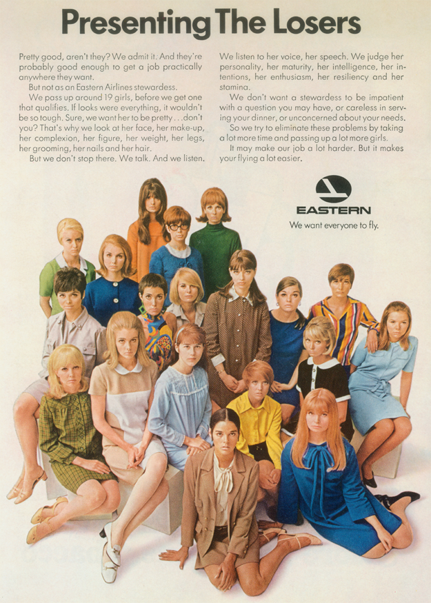
“We want everyone to fly” ran for a relatively short period of time and with nowhere near the media weight of the campaign that came before. In 1964 and 1965, Eastern had rocketed onto the list of the top 100 advertisers in the United States. It dropped off in 1966 and 1967. There were some remarkably artistic ads from the 1967 campaign — including one announcing Eastern’s new nonstop flights from New York to Acapulco, its first to the Pacific, featuring a dramatic photograph of a cliff diver. But the ad that left the most lasting mark was one under the headline “Presenting the losers,” a particularly egregious example of the sexism that pervaded all airline advertising of the era. The ad depicted 19 young women whose applications to be flight attendants were rejected by Eastern, each for reasons including “her face, her make-up, her complexion, her figure, her weight, her legs, her grooming, her nails and her hair.” Sadly, you can find similar ads from every major airline in the magazines of the day.
When Eastern did launch another big push, in April of 1968, it took a similar strategic approach but made the campaign more immediate. Young & Rubicam replaced “We want everyone to fly” with a much less abstract tagline, “We make it easier to fly.” The 1968 campaign was very much an evolution of the campaign from the year before. It covered the same messaging in much the same way, but in a more approachable tone. It framed Eastern’s offering in terms of consumer benefit rather than the virtues of a more airborne society. “We researched the line fully,” Eastern’s director of advertising, John Bresnahan, told the New York Times. “The word ‘easy’ means different things to different people – safe, on time, routine, no complications, no problems.”
In at least one respect, however, the 1968 campaign elevated everything that had come before: the music. In 1967, Y&R had commissioned the film composer John Barry to score a spot entitled “Second Summer.”53 But at the time, John Barry had won only one Oscar for Best Original Score. For “We make it easier to fly,” Y&R turned to someone who had two: Maurice Jarre, the composer of Lawrence of Arabia and Doctor Zhivago. The music premiered during the 1968 Tony Awards and, as before, was also distributed on a 7″ record to Eastern’s employees.
Jarre’s music for Eastern is far more cinematic than the music it replaced. It soars in the theme, in “Airborne,” and in “Flight.” It swings in “The New York Airline.” And it’s wonderfully laid-back in “Summer Holiday,” probably the most contemporary of the five tracks.
But 1968 turned out to be a bad year for Eastern. The airline turned a profit in 1966 despite a 43-day machinists strike, and another profit in 1967 when load factors hit nearly 61% and Eastern carried nearly five million more passengers than the year before. By 1968, costs were again rising faster than revenues and more and more seats flew empty. Eastern lost nearly $12 million.54 The company’s problems weren’t necessarily related to the top line, nor were they Eastern’s alone; the late 1960s held troubling signs for the entire industry. Still, some of the magic had clearly drained away from “the new Eastern.” Young & Rubicam set about trying to recapture it.
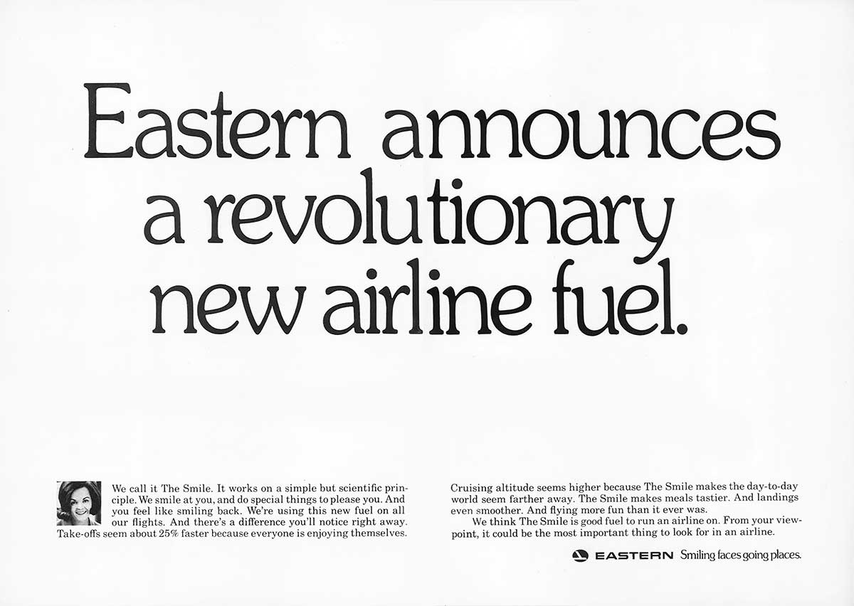
The first attempt was a flop. “Smiling faces going places” debuted in April of 1969, again during the Tony Awards. In Eastern’s journey from bums on seats to the Wings of Man, “Smiling faces going places” is an unexpectedly corny digression. It’s almost as though, for a brief period, Eastern gave up.
“Very few passengers can tell one $8-million plane from another or distinguish between the sophisticated technology that supports its operation,” Eastern’s vice president of marketing told the New York Times. “But everyone understands and relates to that common universal language of the smile.”
“The Smile” is a “revolutionary new airline fuel” that makes “take-offs seem about 25% faster,” the campaign claims with remarkable precision. Jarre’s soaring theme was replaced with a new one, a big bouncy Broadway number by Sid Ramin — a sound that must have been incredibly old-fashioned in 1969. Stewardesses were issued patronizing “do-it-yourself smile pamphlets” that read: “It takes 12 muscles to frown. It takes six muscles to smile. Pleasing a passenger is twice as easy as you thought.”
“Smiling faces” did not live long. There were rumours Eastern’s management was not impressed by it, but when the next campaign launched just six months later, Eastern’s marketing executives insisted “Smiling faces” was either always intended to be a transitional campaign or that it had merely been intended to boost employee morale.55
The new campaign would be different. “This is the campaign that will run forever,” one source told Advertising Age.56 In fact, it would run for a decade — an eternity in advertising.
The Wings of Man
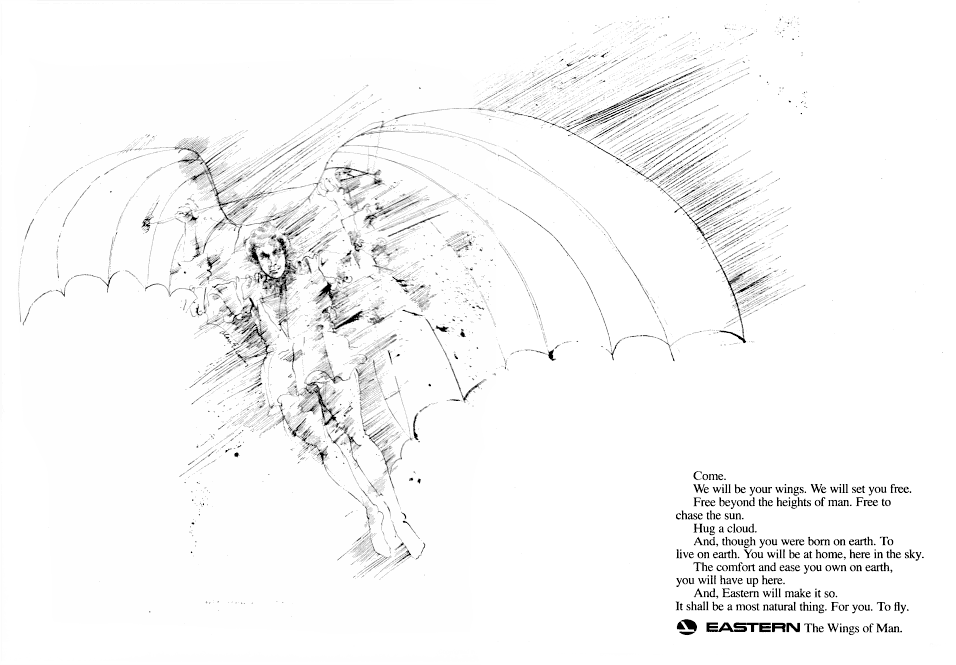
Open on clouds, high above the Earth. The sun shines and the wind howls, only partially obscuring the opening notes of Richard Strauss’s Thus Spake Zarathustra. Cut to an extreme close-up of a man’s eye. The narrator speaks: “From the beginning, man has dreamed of flying.” The orchestra erupts in a fanfare with heavy timpani. “Of breaking the chains that kept him earthbound,” the narrator continues solemnly.
The camera pulls back to reveal that the man is Daedalus, the inventor of Greek legend. He stands atop a cloud with glorious feathered wings strapped to his arms. “Of being free to go anywhere, any time, his heart said… fly!” Daedalus leaps from the cloud and soars into the stratosphere. “At Eastern Air Lines,” the narrator — Orson Welles — continues, “we never forget that what we do today is the realization of that ancient dream. That our job is to make flying natural and comfortable. To make man as at home in the sky as he is on land. To be… the wings… of man.”57
For sheer bombast, the opening salvo of Eastern’s “Wings of Man” campaign has no equal in airline advertising history. The campaign premiered, much like its predecessor of five years before, on an NBC News special, this time entitled “From Here to the Seventies,” a two-and-a-half-hour recap of the events of the past decade that aired Oct. 7, 1969.58
The Daedalus spot was just one of six new Eastern commercials that ran that night, but all were striking. One dramatized the Montgolfier brothers’ first ascent in a hot-air balloon. In another, inspired by 2001: A Space Odyssey, a group of cavemen turn their eyes up toward the moon. In another, a boy releases a bird from a cage as the narrator declares, “There’s a link between man and bird, as between two dreams: the dream of flight and the dream of freedom.”59
Orson Welles replaced Alexander Scourby as the voice of Eastern in one of his first commercial voiceover jobs. Apparently feeling that the new campaign demanded a level of music mere jingle-writers and film composers could not deliver, Y&R instead turned to classical music as arranged by Robert Russell Bennett.60 “By then we’d had it with the Big Melody Thing,” explained a Y&R executive later.61 Eastern executives proudly told the press that the music had been recorded by the London Symphony Orchestra — in fact most of it was recorded by session musicians,62 but the connection to the LSO gave the campaign added grandeur.
Eastern’s claim to be the “Wings of Man” was shaky at best. In the last years of the 1960s, the airline used increasingly convoluted language to exaggerate its size: “more people fly with us than any other airline in the free world but one,” claimed one spot. This was true in terms of enplanements: Eastern carried the third-greatest number of passengers every year after Aeroflot and United. But Aeroflot spanned the globe, and United spanned the continent. Eastern still barely left its home timezone. In terms of passenger-miles, a far more reasonable metric, Eastern ranked sixth — and last among the Big Four.63 In declaring itself “the Wings of Man,” Eastern was compensating for something.
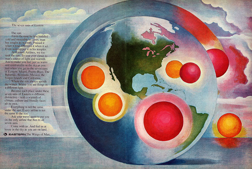
But then, that was sort of the point. If you were to plot Eastern’s seven most important leisure destinations (Miami, Puerto Rico, the Bahamas, Bermuda, Mexico, the Virgin Islands, and Los Angeles) on a map, you would instantly notice that the destinations cluster in a relatively small part of the globe. But if you brand these destinations as the “Seven Suns of Eastern” — the airline that is, after all, “the Wings of Man” — suddenly they seem exciting, exotic, and full of possibilities. Denied the expansive, continent- and ocean-spanning network the airline so desperately wanted, Eastern instead created the illusion of global reach.
Of course, there is such a thing as going too far. The magniloquent prose and overstated imagery of the campaign made some eyes roll. “Among the recent advertising campaigns that have collected more than their share of behind-the-hand snickers is Eastern’s ‘Wings of Man,’ with its moon-craving cavemen and flying Greek,” wrote advertising columnist Philip Dougherty in the New York Times. TWA’s vice president of advertising, Donald Casey, said, “I wouldn’t wish the ‘Wings of Man’ on an enemy.”
Then again, there were signs the campaign was working. Y&R vice-president Alex Kroll told a meeting of the 4A’s that Eastern’s traffic was up in the first three months of the campaign,
And advertising has to take some of the credit, which is a testimonial, I think, to this client. In a category where most people are picking at the same bone, trying to make the same generic sale — call it friendly, happy, or caring — it takes guts for somebody to commit to something this different, this sweeping, this vulnerable to criticism, this long-range. And stick to it.
One research study, performed by NBC, found dramatic improvements in awareness, attitudes, and preferences for Eastern among those who had seen the NBC News special. A 1973 study found “the Wings of Man” was the best-performing airline tagline on television. And anecdotally, Eastern’s workforce was energized by the new line. “They think it’s terrific,” Eastern vice president Maurice Kelly told the Times.
The employees who had once rallied around Eddie Rickenbacker now rallied around an idea. The transformation of Eastern’s brand was complete.
Epilogue
Despite the good years from 1965–1967, Eastern still recorded a cumulative loss of nearly $16 million from 1960–1969. As the decade closed, there was reason for optimism. The loss in 1969 was far smaller than it had been in 1968, and in 1970, 1971, and 1972 the airline made money. Then it lost money in 1973 — a lot of money: $51 million.64 By coincidence, that was the same year Eddie Rickenbacker died.
“The Wings of Man” lived on, however, all the way through the Seventies. In fact it proved remarkably flexible. Already by January of 1970, just a few short months after the launch, Eastern was working to “humanize” it. Budgets were shifted from national buys to local ones. While Y&R still produced some beautiful television commercials, more and more of Eastern’s advertising focused on fares, service, and destinations. As the old saying goes, hard times call for a hard sell. Yet even these harder-selling campaigns still bore the “Wings of Man” tagline.
Throughout the 1960s, the music of Eastern had tracked its progress as an airline. The music critic Alan Rich, impressed by the talent (and earning capacity) of Madison Avenue’s composers and arrangers, wrote that Eastern’s music “indicated the way a successful advertiser can begin to develop a more sophisticated attitude toward music over the years.”65 For the second phase of the “Wings of Man” campaign, Robert Russell Bennett composed a new theme. It played not only under Eastern’s advertising but also at the new attraction Eastern sponsored at Walt Disney World, If You Had Wings.
The beginning of the 1970s also marked the beginning of a changing of the guard. Former astronaut Frank Borman had been aggressively courted by the airline, which he joined as vice president of maintenance in 1970.66 He became Eastern’s president and chief executive officer in 1975, replacing Hall. Although initially reluctant (“Don’t make me sell Tang,” he told one Eastern executive)67 Borman became the face of the company, appearing in much of its advertising for the length of his tenure.
For several years, the advertising held on to the “Wings of Man” tagline. But the ads of the second half of the 1970s struck a much more humble tone. The godlike voice of Orson Welles was replaced by Borman’s folksy honesty. Borman was forthright about Eastern’s challenges but ended each spot with an earnest promise: “We have to earn our wings every day.” Eventually, this would become the airline’s new tagline in 1980.
Eastern’s myriad problems doomed it to bankruptcy in 1991. The causes of Eastern’s demise are debated endlessly to this day; a better question might be how Eastern managed to hold on for so long. But the identity Lippincott designed in 1965 lasted Eastern right through to the end.
And perhaps even longer. Today, a group in Miami plans to launch a new Eastern Air Lines. They hope to begin flying by the end of this year. The new charter airline will use Eastern’s classic livery.
When the group’s Web site first launched, the Eastern logo faced backwards. Perhaps that choice was intentional. Certainly it was symbolic.
Cameron Fleming is an advertising copywriter and creative director in New York.
Updated, June 12, 2014: Added Eastern logo used from 1936 to 1960.
Updated, October 22, 2014: Added quotation from Eastern employee about Smiling Faces campaign.
- Anthony Sampson, Empires of the sky: the politics, contests and cartels of world airlines (New York: Random House, 1984): 15. [↩]
- Robert J. Serling, From the Captain to the Colonel: an informal history of Eastern Airlines (New York: The Dial Press, 1980): 309. [↩]
- Thomas Petzinger, Jr. Hard landing: the epic contest for power and profits that plunged the airlines into chaos (New York: Three Rivers Press, 1996): 176. [↩]
- David Lee Russell, Eastern Air Lines: A history, 1926 – 1991 (Jefferson, N.C.: McFarland, 2013) Campbell-Ewald’s New York office, which handled the Eastern account, changed its name in 1948 to Fletcher Richards but held on to the account until 1963. [↩]
- Serling, 218 [↩]
- Serling, 148 [↩]
- Serling, 269 [↩]
- Serling, 279 [↩]
- It didn’t help that a string of high-profile crashes shortly after the Electra’s introduction irreparably shook public confidence in the turboprop. [↩]
- American, United, TWA, and Eastern. [↩]
- Serling, 315 [↩]
- Floyd D. Hall, “Sunrise at Eastern: rebirth of a pioneer airline” (New York: The Newcomen Society, 1965), 27. [↩]
- Earl designed the interiors of several of Eastern’s airliners around that time, including the DC-8, so it seems likely he designed the exterior as well. Some online sources attribute the design to Raymond Loewy, but Loewy’s heavy involvement in the design of United’s livery and brand in the late 1950s makes that very unlikely. [↩]
- The enigmatic compass E mark appeared in some of Eastern’s advertising, on the covers of its 1961 and 1962 annual reports, and in a number of other random places such as glassware and prototype crew insignia, but it seems only to have appeared sporadically and never merits mention in any of the histories of Eastern. [↩]
- Eastern was an early adopter of television advertising, airing its first spots as early as 1948. “New business,” Broadcasting, Aug. 30, 1948: 12. [↩]
- Eastern Air Lines Inc. 1969 Annual Report, Ten-Year Summary. [↩]
- Serling, 400 [↩]
- Quoted in Ben Rosen, The corporate search for visual identity (New York: Van Nostrand Reinhold Company, 1970): 65. [↩]
- “Pan American expresses a new personality for a new kind of travel,” Industrial Design, Mar. 1959, 36. [↩]
- For the full story of Lufthansa’s corporate identity, see Jens Müller and Karen Weiland, A5/05: Lufthansa + graphic design: visual history of an airline (Zurich: Lars Müller Publishers, 2012). [↩]
- Eastern Air Lines Inc. 1963 Annual Report: 5. [↩]
- Duke University’s John W. Hartman Center for Sales, Advertising & Marketing History, which houses the D’Arcy Masius Benton & Bowles corporate archives, has posted a large selection — likely all — of B&B’s television commercials for Eastern on iTunes for free. [↩]
- The saga of Eastern Air Lines scandalized Madison Avenue. Agencies had first been offended when Eastern asked for “speculative presentations” — that is, presentations that included proposals for strategic and creative work. This expensive process essentially involves doing free work for a client with no guarantee of payment, and though it was unusual at the time, today it is the norm. When B&B only held onto the account for five months after going to all that trouble, the agency business was even more incensed. Several agency heads complained to the press — anonymously, of course. [↩]
- Rosen, 67. [↩]
- Some commentators — notably Al Ries — have attributed Eastern’s demise to its name, arguing that the name stopped Eastern from expanding nationally. Of course, the reason Eastern’s network was confined to the East Coast for most of its existence had nothing to do with the name of the company and everything to do with Eastern’s poor relationship with the CAB. Still, the debate goes on. [↩]
- “Eastern Airlines’ new look,” Industrial Design, Nov. 1966, 45. [↩]
- Robert Heady, “Inauguration to be showcase for new marketing face of Eastern Airlines,” Advertising Age, Jan. 18, 1965: 94. If you are a digital subscriber to the New York Times, you can see all the advertising that has ever appeared in its pages through its extraordinary Times Machine app. For whatever reason, in the 1960s you’d be most likely to find an airline ad in Tuesday’s edition. For example, the Tuesday, Sept. 4, 1962 issue includes ads for Panagra, Eastern, Lufthansa, National, BOAC, SAS, Delta, and Aer Lingus. The new look campaign debuted on page 17 of the Jan. 7, 1965 issue with an otherwise unremarkable retail ad. [↩]
- The ambition of Eastern’s media plan is especially impressive considering that its national buys were largely wasted in the huge parts of the country Eastern did not serve. At that time, that meant almost anywhere west of the Mississippi. [↩]
- Heady, 94. [↩]
- Other Eastern spots from the campaign can be found on YouTube, though not all of these premiered during the Inauguration. The names listed here may not be the originals: Number One to the Sun, Whisperjet, Acapulco, and Big Day’s Work. [↩]
- No one is officially credited as the original composer of the “Fly Eastern” theme, but all the evidence points to Warnick. He’s listed on the credits for several of Eastern’s Clio awards as well as on Y&R’s reels in the collection of the Paley Center. In a discography of works by Andre Kostelanetz, he’s listed as the composer of “Bermuda Concerto” on the Images in Flight record. And he’s also listed by ASCAP, after Paul Creston, as one of the composers of the Images in Flight suite. [↩]
- Buck Warnick, “Monday memo,” Broadcasting, Dec. 19, 1977: 14. [↩]
- Even the name of the suite suggests the visual nature of Eastern’s transformation. [↩]
- Teo Macero to Andre Kostelanetz, Jan. 13, 1965, box 25, folder 13, Teo Macero Collection, JPB 00-8. Music Division, The New York Public Library. [↩]
- Andrea Kostelanetz, Interview with Robert Sherman, The Listening Room, WQXR, Jan. 19, 1972. [↩]
- From a modern perspective, it’s truly remarkable that Eastern was able to engage this calibre of talent. Even more remarkable is that Hovhaness’s fee was apparently just $500 plus royalties from some subsequent performances. Today, a brand would expect to pay tens if not hundreds of thousands of dollars for such a piece of music. Alan Hovhaness to Teo Macero, May 13, 1965, Teo Macero Collection. [↩]
- Kostelanetz, The Listening Room. [↩]
- Kostelanetz, The Listening Room. [↩]
- Teo Macero to Floyd Hall, March 13, 1965, Teo Macero Collection. [↩]
- Young & Rubicam to Kostelanetz, April 7, 1965, Teo Macero Collection. The actual introduction, rather more subdued, was read by Scourby. [↩]
- Honolulu Symphony Society Concert Program, Aug. 27, 1966, Teo Macero Collection. Eastern’s flights to Hawaii and the South Pacific were initially approved by the CAB in 1968, but President Johnson overruled the board’s recommendation and handed the routes to Continental instead. Eastern would never fly to Hawaii. [↩]
- Miami Symphony Orchestra, Teo Macero Collection. [↩]
- Heady, 3. [↩]
- Eastern Air Lines Inc. 1964 Annual Report: 7. As one might expect, this report — the first bearing the new look — was lavishly produced, with beautiful full-colour photographs throughout. It was a far cry from the two-color line-art of earlier annual reports. [↩]
- Serling, 301. [↩]
- Richard Lueking, “Monday memo,” Broadcasting, Apr. 4, 1965: 20. [↩]
- Lueking, 20. [↩]
- Eastern Air Lines Inc. 1965 Annual Report: 12. [↩]
- Eastern Air Lines Inc. 1969 Annual Report, Ten-Year Summary. [↩]
- Heady, 94. [↩]
- Eastern Air Lines Inc. 1966 Annual Report, 6. [↩]
- Serling, 409. [↩]
- Alan Rich, “The melody is the message,” New York, May 17, 1971: 59. [↩]
- Eastern Air Lines Annual Report, 1969. [↩]
- The response of one Eastern employee, included in an internal film, may have been typical: “Our TV commercials just aren’t any good. Smiling faces? One weather day around here and you’re not going to see a smiling face anywhere.” [↩]
- “Eastern shifts to ‘Wings of Man’ motif,” Advertising Age, Oct. 12, 1969. [↩]
- There is a low-quality version of this spot on YouTube; for some reason, it plays at reduced speed which only serves to make the spot more comical. [↩]
- “Eastern Shifts.” [↩]
- A low-quality version of the Montgolfier brothers spot is available on YouTube at reduced speed. The spot with the caged bird is available here. [↩]
- David B. Perry, “Up, up & away with airlines,” Billboard, Feb. 28, 1970: 32. [↩]
- Rich, 59. [↩]
- Perry, 32. [↩]
- R.E.G. Davies, Airlines of the jet age (Washington, D.C.: Smithsonian Institution Scholarly Press, 2011): 428. As of 1970. [↩]
- Serling, 451. [↩]
- Rich, 59. [↩]
- Serling, 444. [↩]
- Serling, 505. [↩]

