Designed for you?
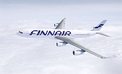
Look at the image above. Do you see an airplane? Look closer. You may just barely be able to make it out. This is the same airplane that, some day soon, will buried in snow on the tarmac in Helsinki and not found again until spring (which I believe takes place for 15 minutes in July if you’re in Helsinki.)
Today, Finnair announced a new, €10-million rebranding as part of its strategic plan to expand in Asia. The airline wants to be the number one airline in the Nordic countries, and in the top three airlines in Asian traffic.
It has a long way to go: Finnair is now only the third-largest Nordic airline and transports less than a third as many passengers as SAS. I’m not sure it’s much a force on Europe to Asia routes either yet, although the new identity comes just a few days after Finnair announced a new interlining agreement with Kingfisher Airlines.
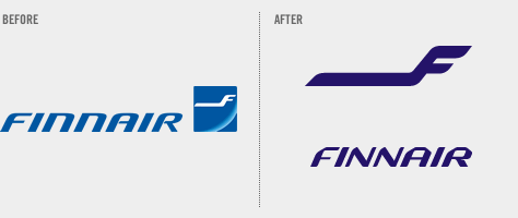
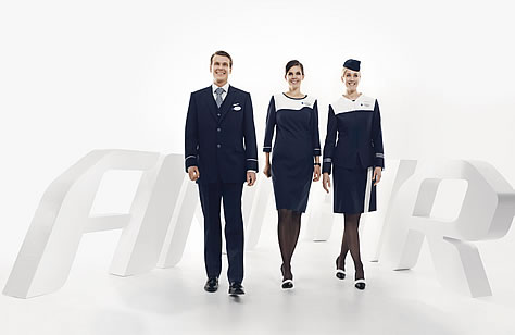
The new identity was designed by SEK&Grey and includes, in addition to the livery, a new logo, new uniforms, and a new microsite.
Obviously it’s going to take a lot more than repainting some planes for Finnair to reach its goal. But does the new brand help?
No. Finnair is going up against the long-haul carriers of Asia — airlines that, at least in terms of service, are without peer (Kingfisher is one of only six airlines in the world awarded five stars by Skytrax, and all six are Asian.) Its identity needs to communicate premium quality. Instead it communicates the opposite.
The Finnair livery fails for the same reason last year’s Tropicana redesign did: it makes the airline look cheap. There’s a very fine line between elegant minimalism and discount branding. The billboard-style livery may have worked for Pan Am, but it doesn’t work here. The new wordmark has a strange, 80s computer look to it. And the all-white planes look like the aviation equivalent of a generic store brand.
There’s definitely a place for that kind of aesthetic. If your product is cheap, you don’t want your packaging to look too expensive. But this is a case where the product is expensive (well, okay, let’s say “premium”) and the packaging looks cheap. Design is a critical signal to the consumer.
Ironically, Finnair’s new tagline is “Designed for you.” Unfortunately, the new look makes it hard to figure out exactly who the airline was designed for: price-conscious leisure passengers, or the expense-account-wielding business travelers Finnair says it is trying to attract?


It's still better than the garbage United is now getting.
Posted by eric on 9 January 2011 at 6:47 am