Last week, American Airlines pulled its flights from Orbitz in a dispute over fees. That means more passengers will have to use the carrier’s Web site to book travel directly. But American’s Web site has long been controversial — just ask interface designer Dustin Curtis.
There. How’s that for a news hook for an 18-month-old story? In fairness, this blog didn’t exist when Curtis launched his attack on American’s Web site in May of 2009. The lessons from that story, however, are timeless.
Before American launched a new Web site in mid-November, their homepage really hadn’t changed in almost a decade. It showed. The site was cluttered. Dated. Ugly. This is the site Curtis arrived at in 2009, and the site he trashed in a subsequent blog post. Read more
December 27th, 2010 \ Posted in Digital \ No Comments »

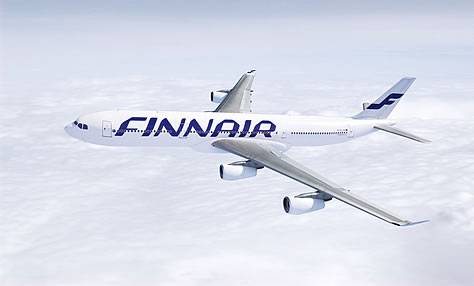
Look at the image above. Do you see an airplane? Look closer. You may just barely be able to make it out. This is the same airplane that, some day soon, will buried in snow on the tarmac in Helsinki and not found again until spring (which I believe takes place for 15 minutes in July if you’re in Helsinki.)
Today, Finnair announced a new, €10-million rebranding as part of its strategic plan to expand in Asia. The airline wants to be the number one airline in the Nordic countries, and in the top three airlines in Asian traffic.
Read more
December 20th, 2010 \ Posted in Liveries \ 1 Comment »

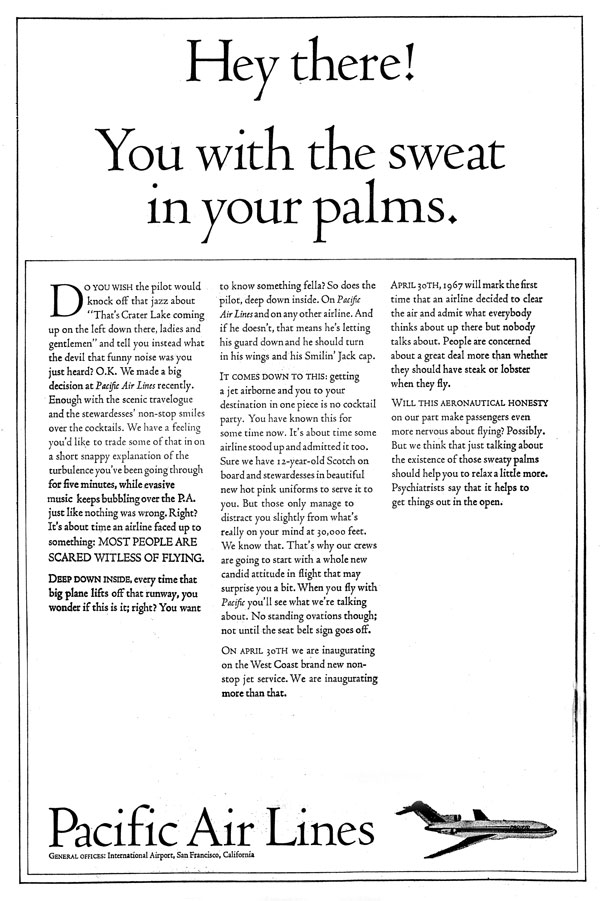
You’re looking at the stupidest airline ad ever produced.
On April 28, 1967, Pacific Air Lines ran this full page ad in the New York Times. It was created by advertising (and comedy) legend Stan Freberg in a bid to bring some honesty to airline advertising. But while the ad may have been honest, it didn’t do much good for Pacific Air Lines.
It is not true, as is often reported, that the ad drove Pacific Air Lines into bankruptcy two months later. In fact, Pacific merged with two other carriers to form Air West, and the forces that compelled the merger had little to do with advertising. But the ad did, within days, cost the jobs of the airline’s vice president of marketing and its director of advertising, and it quickly became notorious.
Read more
December 17th, 2010 \ Posted in Advertising \ No Comments »
URL
The employees of United have spoken: the winner of the retrojet contest is the Friend Ship livery from the early 1970s. The classic colours will be painted on an A320 sometime next year.
December 15th, 2010 \ Link
URL
In news that should come as no surprise to readers of this blog, Advertising Age takes a look at U.S. airline branding and decides baggage fees and on-board experience trump advertising.
November 29th, 2010 \ Link
 News leaked this week that United Airlines is polling its current and former employees on which classic livery to feature on a 757 next year. The livery will celebrate the airline’s 85th anniversary. Thanks to @GordonWerner, you can see the five options here. I don’t want to unduly influence the voting, but the Mainliner colours sure look sharp…
When United’s “retrojet” takes to the skies, it will join dozens of other airplanes painted in the bygone colours of dozens of different airlines. It seems almost every airline has a retrojet these days. The trend started ten years ago, and is only gaining momentum. Read more
November 22nd, 2010 \ Posted in Liveries \ No Comments »
URL
Since 1952, business class passengers on KLM have been given miniature Delft houses filled with gin. Now KLM has a very nice microsite you can use to find out more about the 91 different miniatures. It also offers a mobile app you can use to find the houses in the real world. The KLM houses are apparently a big deal in the Netherlands; according to the Wall Street Journal, they are considered a real status symbol.
November 20th, 2010 \ Link
URL
People often ask if airlines still hand out junior wings. Some of them do—I know Continental does, for example. Now, Delta Air Lines has just started handing out new junior wings with the all-red widget logo.
November 5th, 2010 \ Link
URL
Just in time for Halloween, another zombie Pan Am is rising from the dead. The newest incarnation—the fifth—plans to start flying cargo flights to South America in 2011. The airline’s brand-new logo is not as iconic as the blue meatball designed by Edward L. Barnes in the 1950s.
October 29th, 2010 \ Link
URL
How will the merged United Airlines roll out its new brand? It’s starting with the in-flight safety video, now common to both United and Continental. The video features, to my mind, a particularly unfortunate application of Rhapsody in Blue.
October 29th, 2010 \ Link


