 “Champagne, sir?” asks the flight attendant.
“Oh, no, I couldn’t possibly,” I answer graciously as I recline in my first-class seat, nonstop from New York to Nice. My seat companion, a famous movie star, wants to hear my story about that shoot I went on that one time, but I’ve already delighted her with it seven times and now I grow weary. I settle in for a few hours of blissful slumber.
Yes, fine, you’re right, this flight is only happening in my imagination. For the fourth year in a row, Branded Skies reports on Cannes from nearly 4,000 miles away.
But what a year it has been for airline brands. For the first time since 2009, work for an airline won a Grand Prix. Of course, it won in the least likely category. But that’s Cannes, where a billboard with no response mechanism at all can be crowned the best direct response work of the year.
It doesn’t have to make sense.
Note: Before long, the links to the winners’ pages will go behind one of the most expensive paywalls on Earth. I have therefore tried to include information about each campaign outside of the Cannes Lions Web site.
British Airways, “The Magic of Flying”
Agency: OgilvyOne, London
- Grand Prix, Direct
- Gold, Cyber
- Gold, Media
- Gold, Media
- Gold, Outdoor
- Gold, Promo & Activation
- Silver, Cyber
- Bronze, Promo & Activation
- Bronze, Promo & Activation
The magic of this campaign comes from its beautiful simplicity. For all the technology involved, it’s still just a really fancy billboard. I suspect few people ever saw it with their own eyes, but millions saw it online. A billboard it may have been, but it was a viral billboard.
This campaign probably won more awards at Cannes than any airline work in history, if for no other reason than it has only recently become possible to win in so many categories. While this wonderful work undoubtedly deserves recognition, the fact that it attained its greatest success in the Direct category reveals the absurdity of Cannes today. There’s nothing direct about it. It has no call to action, no offer, no response mechanism. It’s just a really charming piece of advertising.
How does this happen? Follow the money. Cannes is big business, and more categories means more entries means more money. Ogilvy spent $5,208.30 just to enter the categories where the campaign won. ((This is assuming all the entries were submitted on time. In my experience of agency life, that’s unlikely — which means another $100 or so per entry.)) There were many more categories where it didn’t: Titanium, for example, where each entry costs $1,836.
The costs don’t end there. Now that the campaign has won, it will cost $3,284 just for the Direct Grand Prix trophy. I hope Ogilvy springs for it, though — the team deserves it.
Transavia, “eBay”
Agency: Les Gaulois, Puteaux, France
The bright side of the proliferation of categories at Cannes is that some of the most interesting work is happening in some of the newest categories. Some of the best work these days happens in Promo & Activation. The heart of this campaign is an innovative new sales channel for airline tickets. It’s a clever partnership, cleverly promoted. And it’s hard-working, too.
Transavia, “The Takeoff”
Agency: Les Gaulois, Puteaux, France
Transavia’s other winning campaign is less impressive. It’s part of a genre of campaigns in which a brand stages some sort of stunt (mercifully not a flash-mob, this time) then posts the video on YouTube. Though the video achieved 1.8 million views, that seems to have been purely a result of a paid media campaign and not because it actually went “viral.” ((The number of views climbs at an unrealistically steady pace for one week, then levels off to be almost flat.)) Putting the price of an airline ticket into context is smart, but the creative feels uninspired.
Aerolineas Argentinas, “Landing,” “Night Flight,” and “Take Off”
Agency: Madre, Buenos Aires
- Silver, Film
The only airline winner in Cannes’ original category, Film, was Aerolineas Argentinas, with a stunning series of television spots. In this business, finding something about your airline that makes it different from all the others is no easy task. Sometimes, that thing can be very simple.
Aerolineas Argentinas found that one of its ancestor companies employed a very famous pilot: Antoine de Saint-Exupéry. Few people have written more beautifully about aviation. The script was already written; the only thing left was to produce film that lives up to the lyricism of Saint-Exupéry’s prose.
S7 Airlines, “Catch a Plane”
Agency: Leo Burnett, Moscow
- Silver, Mobile
This is a pretty fantastic case study video for a pretty clever promotional idea. Again, the key to its appeal is its simplicity. It’s very easy to get just what this app does. And it’s a very smart way to reveal the scope of S7’s network.
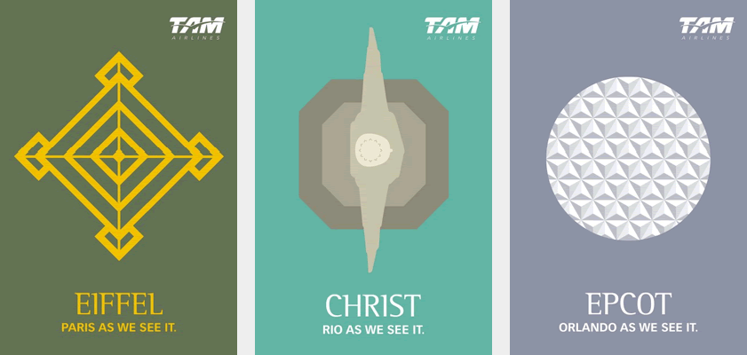
TAM, “Eiffel,” “Christ,” and “Epcot”
Agency: Young & Rubicam, Sao Paulo
- Silver, Outdoor
 Three posters for TAM Airlines.
Then again, there might be such a thing as too simple? These posters do nothing for me. Not only was the minimalist poster trend played out a few years ago, these aren’t even great examples.
WestJet, “Christmas Miracles”
Agency: Mosaic, Toronto
WestJet already won the most important prize a Canadian brand can possibly win: this campaign got it mentioned on American news channels, an honour so great it’s even worth inevitably being described as an “obscure” airline. ((For the record, at the time of the campaign WestJet had twice as many airplanes as Virgin America and flew to more destinations than JetBlue. On the basis of available seat-kilometers, it was about the same size as Air New Zealand and SWISS and bigger than Alitalia, airberlin, and Virgin Australia. It has 40 – 45% market share in an obscure country called Canada.))
WestJet’s Christmas miracle generated a lot of goodwill for the airline and was unquestionably one of the great advertising successes in the category last year. I’m surprised it only managed Bronze Lions, and even more surprised that it was shut out of PR — it failed even to make the shortlist. I wonder if it may have been hampered by its case study video. In any event, 328 million media impressions for an “obscure” Canadian airline is still a result you can take to the bank.
British Airways, “Ungrounded”
Agency: Ogilvy, New York
- Bronze, PR
The other winning campaign from British Airways won in Public Relations, a category that, Cannes being Cannes, is almost totally dominated by advertising agencies. It’s a smart campaign from Ogilvy New York. The win must be bittersweet for Ogilvy — bitter because BA dropped the agency when it consolidated with BBH earlier this year, sweet (in a less high-minded way) because it’s always nice to show a departing account how wrong they were to dump you and BBH’s work for BA this year didn’t win anything.
Lufthansa, “Are you Klaus-Heidi?”
Agency: DDB Stockholm
- Bronze, PR
I still don’t get this campaign.
Disappointments
I was disappointed this film for Turkish Airlines didn’t win anything, failing even to make the Film Lions shortlist. I found it enormously touching and exceptionally produced. But hey, if I can take an imaginary flight to Cannes, then I can also award Turkish, and its agency, Lowe Istanbul, an imaginary Lion. Congratulations!
I was also disappointed this campaign for British Airways, from Ogilvy New York, didn’t win. “Visit Mum” was shortlisted in Cyber, but I think it deserved better.
Until next year
This week, those of us who took imaginary flights to Cannes will be reunited with creative directors who are even now taking real flights home. Invariably, those creative directors will return inspired and determined to win trophies of their own next year. And invariably, some of that enthusiasm will ebb in the face of advertising’s day-to-day realities.
That’s why I hope the work that won at Cannes this week can inspire clients as well. Airline advertising can go far beyond fares, seats, and power outlets. It can create brands people are genuinely moved by and attracted to. The opportunities exist; agencies and clients just need the vision to seize them.

99aANxbgTV9
Posted by condimentum on 20 February 2025 at 6:25 pm
h1UsUJoXNUX
Posted by strapless on 20 February 2025 at 8:10 pm