
Year one
Today marks the first anniversary of Branded Skies’ first post, “In the pursuit of flying turtles.” It’s been a pretty decent year for the airline industry. Profits are up at many carriers, although oil prices make the future uncertain. A number of airlines have also launched new campaigns in the past 12 months, Delta, JetBlue, Finnair, and Singapore Airlines among them. I don’t have access to figures, but I suspect media spending is up considerably.
As for Branded Skies, it turns out one of the best ways to learn about something is to write about it until you know it. I’ve learned a lot about airline branding in the past 12 months, and I look forward to learning more in the next 12 months.
Until then, here are my favourite five posts of the past year.
- The Day the Industry Changed: Why don’t large advertising agencies have large airline accounts anymore? I hit the microfilms to find out.
- Why Safety Isn’t Safe: Airline advertising almost never makes direct references to safety. Why? And can you say safety without saying safety?
- Zombies! How did Pan Am end up as a railroad? For some reason, investors keep trying to resurrect defunct airline brands — and it never seems to work.
- Super*bleep*: Once upon a time, airlines used to advertise in the Super Bowl. No longer.
- Tropes: The Singing Jumbo Jet: Have you seen the other side of where you live? Don’t you know this great big land has got so much to give? Mother country’s got her arms open wide… the friendly skies of your land, United Airlines…
And on the subject of tropes, here’s the very first Tropes entry: Sunsets.
In case you’re wondering, the five most popular posts on Branded Skies are:
- Save the Tulip
- The Day the Industry Changed
- Super*bleep*
- In the Pursuit of Flying Turtles
- Designed for You?
Speaking of popularity, by far the most popular part of this site is the section on junior wings, which has had more than twice as many hits as the main page. The most popular wings are:
- Aer Lingus (not coincidentally, the first one alphabetically)
- Hooters Air (not coincidentally, the only one with “Hooters” in the name)
- US Airways
- Pan Am
- United Airlines
I started collecting wings as a kid, but then I stopped. On March 31, 2010, I added the first new pair of wings in a decade to my collection: these wings from National Airlines, still among my favourites. Since then, the collection has grown from 11 wings to 316 wings from 133 different airlines in 43 different countries on six different continents. And these are my favourites:
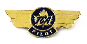
As a Canadian, I’ve put a special emphasis on collecting wings from Canadian carriers, even breaking some rules of my collection (such as the prohibition against stickers.) So these foil-stamped Trans-Canada Air Lines wings were a particularly exciting find.
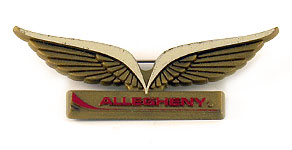
After Canadian wings, my priority is on former U.S. regional airlines, especially pre-deregulation — airlines like Ozark, Piedmont, North Central, and Allegheny. The Allegheny wings are a bonus because they also feature late 1970s design. My favourite wings tend to be plastic and come from the late 70s to mid-80s, when airline logos were bold and colourful.
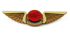
Another late 70s design. This is one of three airline logos designed by the late great Saul Bass. The most famous is United’s tulip, but I always liked Continental’s “meatball” better. This is one of the 11 wings I collected as a kid.
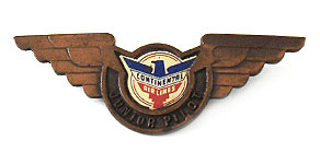
More Continental wings, but these are about thirty years older.
These are the newest wings in my collection. In late 2010, Delta started handing out junior wings again. They’re actually quite well-made — even better than wings in the past.
These wings, for Eastern Air Lines, may be the most ubiquitous wings out there. Right now, you can buy a bag of 1,000 for $50 on eBay — and I still think 20¢ per pair of wings is overpriced. Eastern must have taken delivery of these wings 15 seconds before they went bankrupt. But even though the wings are so common, I’ve always liked Eastern’s simple “hockey stick” logo.
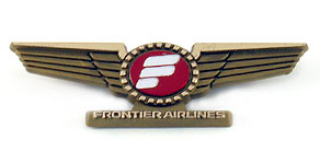
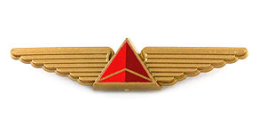
The logo for Frontier Airlines was the third airline logo designed by Saul Bass. It was a great logo and it was, and still is, a great name for an airline.
I spent a lot of time looking for these wings before finding them at an airline collectibles show. I love the colours and the design. As you’ll see, many of the plastic wings were made by the same manufacturer — Stoffel Seals — using the same basic shapes, so the wings with a unique design are particularly interesting.
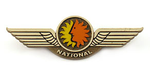
As mentioned before, these were the first new wings I added to my collection in 2010. National really did have one of the great airline logos.
These wings, for Northeast Airlines, may be among the rarest in my collection. I love the pilgrim.
As a kid, this was my favourite pair of wings, and that was before I even noticed how clever Landor’s logo for Northwest Airlines was (Look! It makes an N, and a W, and the arrow is pointing to the northwest!)
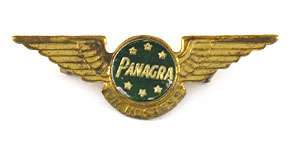
Another candidate for rarest wings in my collection. Panagra (Pan American-Grace Airways) was a joint venture between Pan Am and the Grace Shipping Company that flew to South America. It was eventually sold to Braniff, an airline that, for all its style, never had very exciting junior wings.
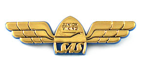
It’s a viking helmet with wings. What more needs to be said?
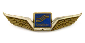
Another defunct U.S. regional airline with a great 70s-era logo. Southern merged with North Central to become Republic, which was purchased by Northwest, which was merged with Delta.
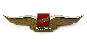
Great wings. Great logo. Terrible livery. Western was purchased by Delta.
Thank you for reading Fly the Branded Skies in its first year! There’s much more to come in the years ahead…